Project

Helping A Snack Stand Out

Helping A Snack Stand Out
Client Wah Snacks
Role Brand / Digital / Packaging

Standing Out in A Sea of Products – Our Challenge

Every aisle of every store is inundated with a plethora of products – giving customers an incredible number of choices – sometimes perhaps too many.

Enter Wah Snacks, a producer of potato sticks, chips, chana, and other savoury items. While Wah Snacks already had an existing catalogue of products, they wanted their products to feel connected rather than a mix & match of designs.

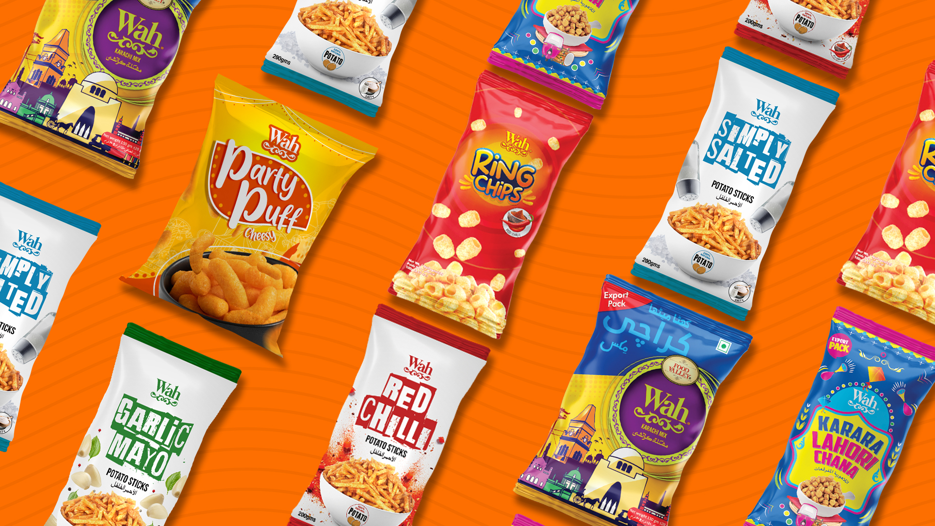
Our challenge was creating packaging that connected several different products and did so in an attractive way – a way that would attract eyes and lead to purchases.

KV-WAH-2

Stronger Together – Our Objective

We immediately set out to create eye catching packaging that would earn the attention of potential customers. We wanted each range to have its unique feel while connecting to the overall brand.

Easy on the Eyes – How We Did It

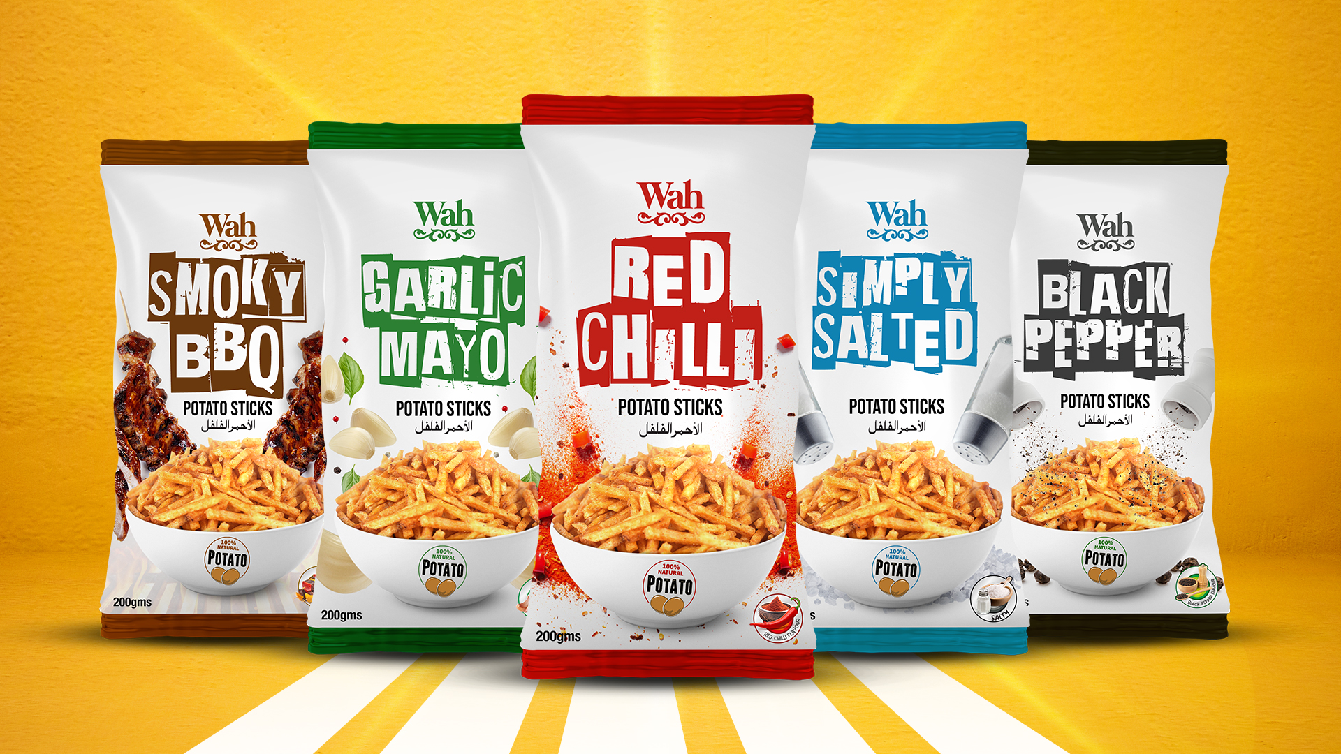
To achieve our objective, we created several different overall designs that we then tailored to fit specific products. For instance, we had one design for Wah’s Potato Sticks, but we would make minor, easy to catch adjustments to reflect different flavours (Red for Red Chilli, Black for Barbecue, and so on).

The new packaging coupled with a revamped social media presence and constant quirky posts helped Wah truly stand out on the shelves and in customer’s minds.

For Wah, the packaging refresh served as a brand refresh of sorts, helping them be seen as a new brand for the many who had missed it in the first place.